
Everything you need to know about candlestick
This comprehensive guide explores candlestick charting, covering its history, key patterns, and trading strategies. Learn how candlestick patterns like Doji, Engulfing, and Morning Star reveal market sentiment and potential trend reversals. Master the art of reading candlesticks for informed decision-making in stock trading and technical analysis.
In this article, you will gain a comprehensive understanding of candlestick charting—from its origins in 17th-century Japan to its evolution as a powerful tool in modern trading across various markets. You will learn how candlestick patterns, with their unique blend of price action and trader psychology, provide valuable insights into market sentiment, trends, and potential reversals.
The origins of candlestick charting trace back to 17th-century Japan, where rice trader Munehisa Homma developed this technique to predict price movements in the rice market. Over time, his methods evolved and gained popularity, eventually becoming an essential tool for traders worldwide. Today, candlestick charting extends beyond traditional markets and is widely used in stock and commodities trading.
Originating in Japan during the 1700s, candlestick charts were first used by Homma, who recognized that market prices were influenced not just by supply and demand but also by emotions—principles that still hold true for modern markets. By the early 1900s, these techniques caught the attention of Western traders, particularly through Charles Dow. However, Steve Nison’s 1991 book Japanese Candlestick Charting Techniques played a crucial role in popularizing candlestick charts in the West, offering clear explanations that made these tools accessible to a broader audience.
Introduction to Candlestick Patterns
Candlestick patterns are a fundamental aspect of technical analysis, providing valuable insights into market sentiment and potential price movements. Used by traders worldwide, these patterns help identify trends, reversals, and key entry or exit points. Understanding candlesticks patterns and reading candlesticks is essential for making informed trading decisions.
How Does a Candlestick Form?
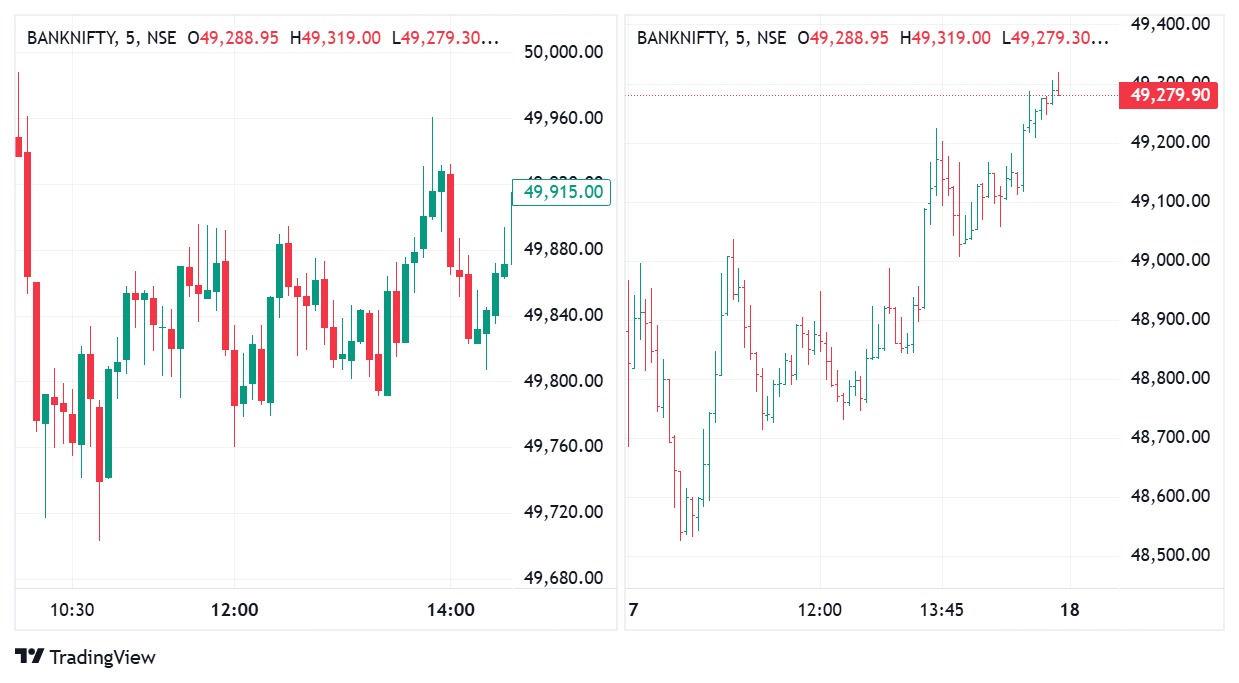
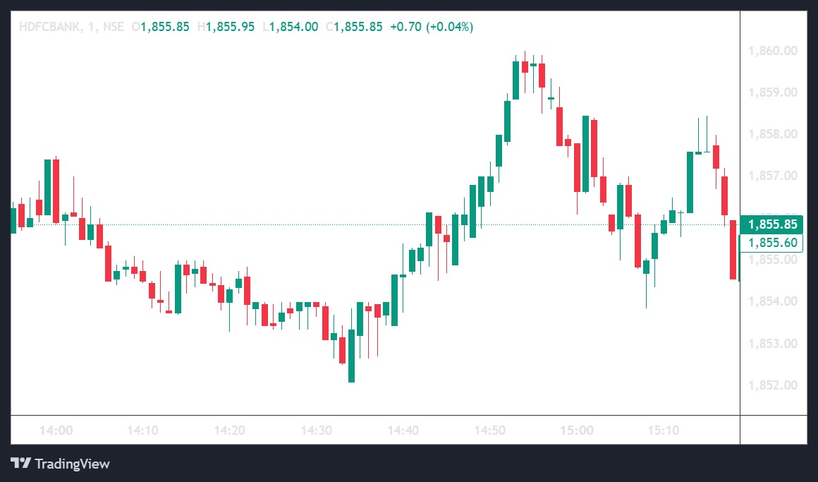
Ever wondered about the green and red candles on your chart and what they represent? Candlesticks visually depict price action over a specific time frame—whether it’s minutes, hours, days, weeks, or months. Here’s how they form:
- Opening Price: The price at the start of a trading period.
- Price Movement: Prices fluctuate as buyers and sellers push the price up or down.
- Closing Price: The final price at the end of the trading period.
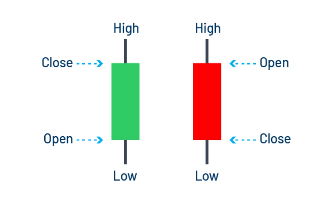
The relationship between the opening and closing prices determines whether the candlestick is bullish or bearish:
- Green Candle: If the closing price is higher than the opening price, a green candle forms, indicating buyer dominance.
- Red Candle: If the closing price is lower than the opening price, a red candle appears, showing seller control.
Each candlestick tells a story of price movements, illustrating the ongoing battle between buyers and sellers.
Visual Appearance of Candlestick Patterns on a Chart
Candlestick patterns arise from combinations of one or more candlesticks and can indicate potential future price movements. Some candlestick charting explained: Single Candlestick Patterns: Such as Doji and Spinning Tops, which indicate indecision in the market.
Multiple Candlestick Patterns: Like Bullish Engulfing and Bearish Engulfing patterns, which suggest potential reversals in trend direction.
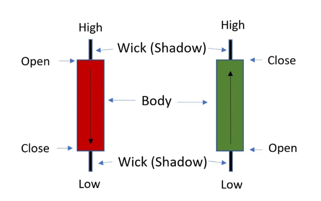
Breaking Down the Body, Wicks, and Shadows
A candlestick consists of three main components:
-
Body: The body of the candlestick represents the range between the opening and closing prices for a specific time period. If the closing price is higher than the opening price, the body is typically filled with a lighter color (often green or white), indicating bullish sentiment. Conversely, if the closing price is lower than the opening price, the body is filled with a darker color (often red or black), indicating bearish sentiment.
-
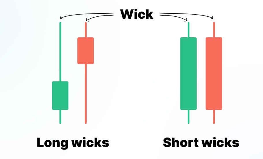
Wicks (or Shadows): The wicks are the lines extending above and below the body of the candlestick. They represent the highest and lowest prices reached during the time frame. The upper wick shows how high the price rose above the body, while the lower wick indicates how low it fell. Wicks can provide insight into market volatility and rejection levels.
-
Shadows: The terms ‘wicks’ and ‘shadows’ are often used interchangeably in trading literature. However, they both refer to the same lines that extend from the body. The length of these shadows can indicate buying or selling pressure during that period.
How to interpret Candlestick?
Interpreting candlesticks is an art every trader should master. Each candlestick tells a story about the market's mood and price action during a specific time frame.
A candlestick represents day trading candlestick patterns data, summarizing four key price points: open, high, low, and close. The rectangular portion of the candlestick is the real body, showcasing the range between opening and closing prices.
Red and green candles are key components of candlestick stock chart, which traders use to analyze price movements. Each candlestick represents a specific time period and provides information about the opening, closing, high, and low prices of an asset.
-
Red Candle: This forms when the opening price is higher than the closing price, indicating a price decline during the time frame. It suggests bearish sentiment, meaning sellers dominated the market.
-
Green Candle: This forms when the closing price is higher than the opening price, indicating a price increase. It reflects bullish sentiment, showing buyers were in control.
The wicks, or shadows, are thin lines extending above and below the body of a candlestick, representing the day’s highs and lows. The wicks provide crucial information: Short Upper Wick on a Green Candle: Indicates strong buying pressure, with the price closing near its high.
-
Short Upper Wick on a Red Candle: Suggests selling pressure overwhelmed an initial price increase.
-
Long Upper Wick on a Green Candle: Shows buyers pushed the price up but couldn’t sustain those levels, hinting at resistance.
-
Long Lower Wick on a Red Candle: Implies sellers drove the price down, but buyers stepped in to push it back up, indicating support.
The position of a candlestick about previous candles also adds context. For example, a bullish candle forming after a series of bearish ones may signal a trend reversal.
Understanding these patterns helps traders gauge market sentiment and make informed decisions. Whether you are spotting trends or identifying reversals, candlesticks provide clarity in the chaos of trading.
Having a chart that showcases different types of candles can be incredibly useful for traders. It’s a great idea to hang this chart on the wall while trading – this way, you can easily reference it throughout the day. By consistently seeing the various candles and understanding their significance, you will quickly get familiar with how each candlestick differs.
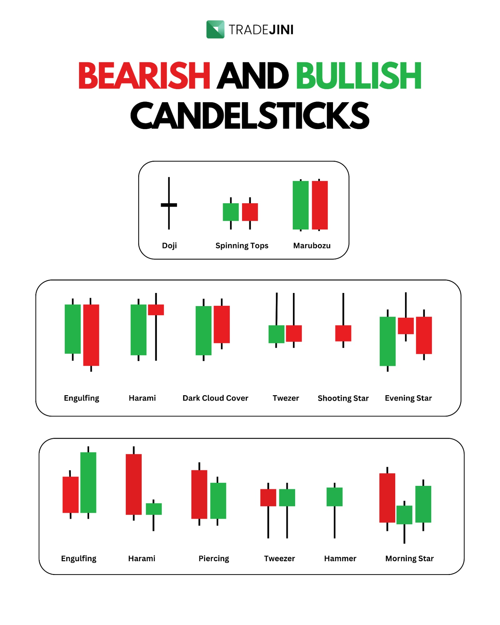
Types of Candlestick and Their Interpretation
Single Candlestick Patterns
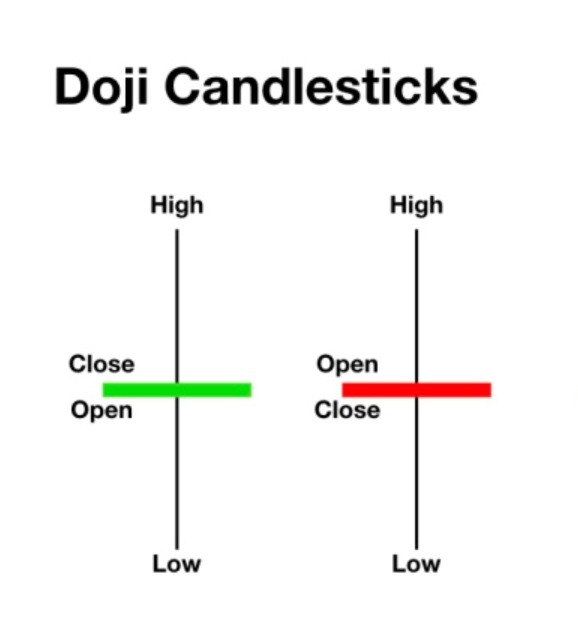
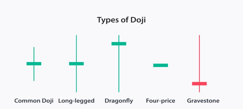
1) Doji:
The Doji is a candlestick pattern that indicates market indecision, occurring when the opening and closing prices are nearly the same. It represents a situation where both buyers and sellers are trying to dominate, but neither side is able to establish clear control. The Doji suggests that there is uncertainty in the market, often signaling a potential reversal or pause in the current trend. Its significance depends on its position in the chart and the surrounding price action, making it a useful tool for traders to assess market sentiment.
Characteristics of Doji Candlesticks
- Formation: A Doji is formed when the opening and closing prices are virtually equal, leading to a candle that may resemble a cross, inverted cross, or plus sign. The length of the shadows can vary significantly, indicating volatility during the trading period.
- Types of Doji: There are four main variations of Doji:
- Common Doji: Basic form with short shadows.
- Gravestone Doji: Appears at market tops, suggesting potential bearish reversals.
- Dragonfly Doji: Found at market bottoms, indicating possible bullish reversals.
- Long-Legged Doji: Features long shadows and signals indecision, often indicating potential trend changes.
Significance of Doji Patterns
The significance of a Doji is heavily influenced by the preceding price action:
-
In Uptrends: A Doji following a long bullish candle may indicate that buying pressure is weakening, suggesting a potential reversal to bearish sentiment.
-
In Downtrends: Conversely, after a long bearish candle, a Doji can signal that selling pressure is diminishing, hinting at a possible bullish reversal.
-
Market Context: The context in which a Doji appears is crucial. For instance, if it forms at key support or resistance levels, its implications for future price movements become more pronounced.
Trading Strategies Involving Doji
Traders often use Doji patterns as part of broader trading strategies:
-
Confirmation Required: A Doji alone should not be the sole basis for trading decisions. Traders typically look for confirmation from subsequent candlesticks before acting. For example, if a Doji appears at the top of an uptrend followed by a bearish candle, it may be interpreted as a sell signal.
-
Volume Consideration: The volume accompanying the formation of a Doji can enhance its significance. A high-volume Doji indicates stronger indecision and potential reversal compared to one with low volume
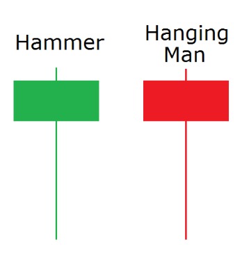
2) Hammer and Hanging Man:
Two commonly recognized patterns within this system are the Hammer and the Hanging Man. Despite their similar appearance, these patterns signal different market behaviors depending on their context. Let's break them down step by step.
What Are the Hammer and Hanging Man Candlestick Patterns?
-
Hammer: The Hammer is a bullish reversal pattern that typically appears at the end of a downtrend. It signals that the selling pressure is subsiding, and buyers may be regaining control. The name comes from its resemblance to a hammer, as it ‘hammers out’ a bottom.
-
Hanging Man: The Hanging Man, on the other hand, is a bearish reversal pattern found at the top of an uptrend. It suggests that while buyers are still active, sellers are starting to dominate, and a potential trend reversal or slowdown could be imminent.
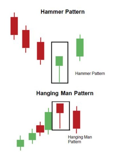
Key Characteristics of the Hammer and Hanging Man
Both patterns share a similar structure, which makes understanding their differences even more important. Here's what they look like:
-
Shape and Structure:
- A small real body (the rectangular part of the candlestick).
- A long lower shadow (at least twice the size of the body).
- Little to no upper shadow.
-
Position Matters:
- Hammer: Found at the bottom of a downtrend.
- Hanging Man: Found at the top of an uptrend.
-
Color (Bullish/Bearish):
-
- While the color (green or red) of the candle can add context, it is less significant than the location of the pattern. However, for a Hammer, a green (bullish) body strengthens the signal, whereas for a Hanging Man, a red (bearish) body provides more conviction.
Tips for Using These Patterns Effectively
-
Confirmation is Key: Both the Hammer and Hanging Man need confirmation from subsequent candles to ensure the signal is valid.
-
Combine with Other Indicators: Tools like RSI (Relative Strength Index), MACD, or moving averages can add conviction to your trades.
-
Market Context Matters: Always consider the broader market trend, volume, and news sentiment before making decisions.
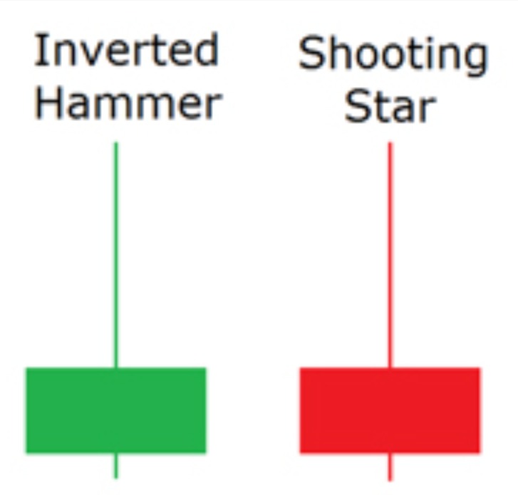
3) Inverted Hammer and Shooting Star
-
Inverted Hammer: The Inverted Hammer is a bullish reversal pattern that typically appears at the bottom of a downtrend. It signals that selling pressure may be weakening, and buyers are stepping in, suggesting a potential reversal to the upside.
-
Shooting Star: The Shooting Star, in contrast, is a bearish reversal pattern found at the top of an uptrend. It indicates that while buyers tried to push the price higher, sellers gained control, often marking the beginning of a downtrend or correction.
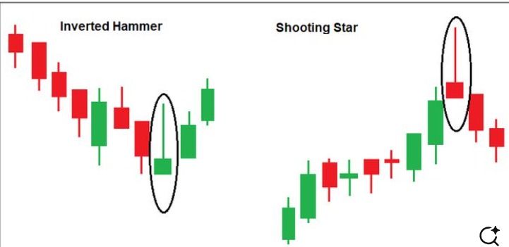
Key Characteristics of the Inverted Hammer and Shooting Star
While these patterns share a similar appearance, their interpretation depends on their position in the market trend.
-
Shape and Structure:
- A small real body near the bottom of the candlestick.
- A long upper shadow (at least twice the length of the body).
- Little to no lower shadow.
-
Position Matters:
- Inverted Hammer: Found at the bottom of a downtrend.
- Shooting Star: Found at the top of an uptrend.
-
Color (Bullish/Bearish):
- The color of the candle (green or red) can add weight to the signal but is secondary to its context.
- For the Inverted Hammer, a green (bullish) body strengthens the bullish reversal signal.
- For the Shooting Star, a red (bearish) body reinforces the bearish signal.
Tips for Effective Use
-
Confirmation is Critical: Always confirm the pattern with subsequent price action or other technical indicators before acting.
-
Volume Analysis: Higher trading volumes on the day of the pattern can strengthen the reliability of the signal.
-
Combine with Indicators: Tools like RSI (to check for overbought/oversold conditions) or moving averages can enhance accuracy.
-
Market Context: Consider the overall trend and market sentiment to ensure the pattern aligns with broader conditions.
-
Risk Management: Use stop-loss orders and position sizing to manage potential losses effectively.
Bullish Multi-Candlestick Patterns
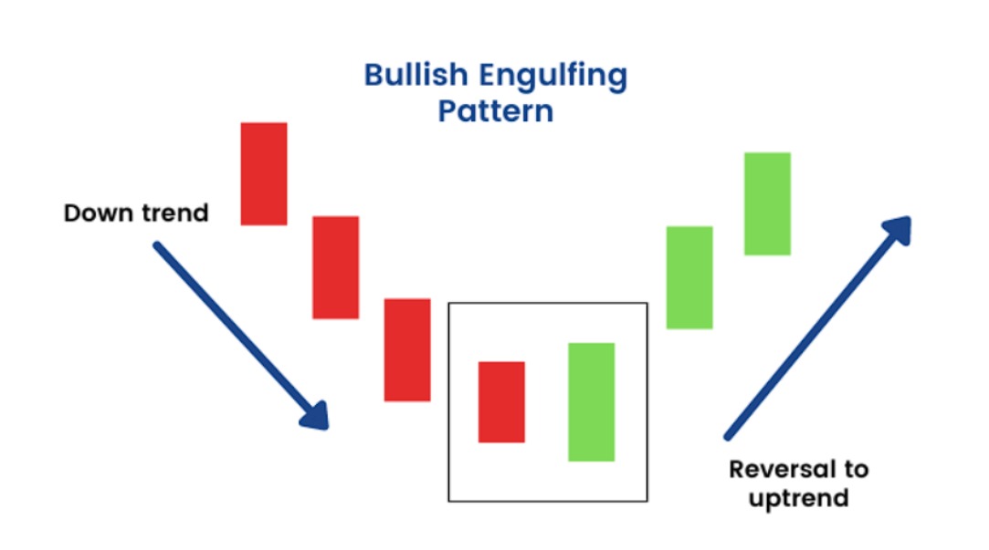
1) Bullish Engulfing
-
What It Is:
- The Bullish Engulfing pattern is a two-candle reversal signal that appears at the end of a downtrend. A large green (bullish) candle completely engulfs the prior red (bearish) candle.
-
Significance:
- This pattern indicates that buyers have regained control, and an upward reversal may follow.
-
Key Characteristics:
- The second candle’s body fully engulfs the first.
- Typically occurs at the bottom of a downtrend.
- Stronger if accompanied by high volume.
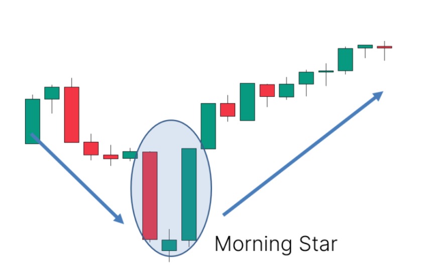
2. Morning Star
-
What It Is:
- The Morning Star is a three-candle pattern that signals a bullish reversal. It starts with a long red candle, followed by a small-bodied candle (red or green), and concludes with a long green candle.
-
Significance:
- This pattern suggests that selling pressure is waning, and buyers are stepping in to drive prices higher.
-
Key Characteristics:
- The middle candle represents indecision (often a Doji or small body).
- The third candle closes well above the midpoint of the first candle.
- Appears at the end of a downtrend.
Bearish Multi-Candlestick Patterns
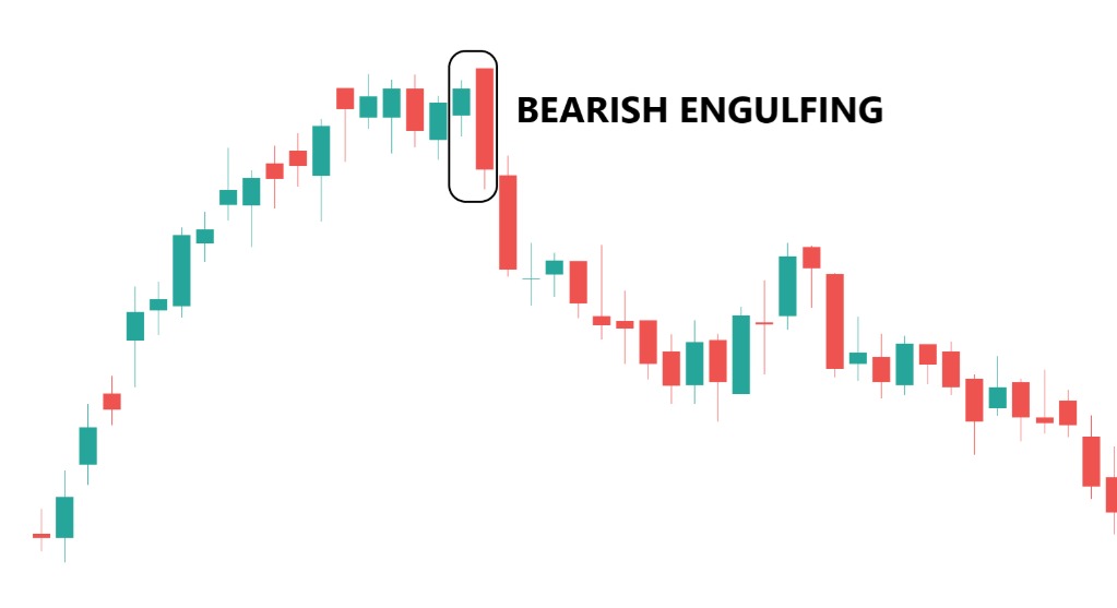
1. Bearish Engulfing
-
What It Is:
- The Bearish Engulfing pattern is a two-candle reversal signal that appears at the end of an uptrend. A large red (bearish) candle completely engulfs the prior green (bullish) candle.
-
Significance:
- It signals that sellers are now in control, potentially reversing the trend downward.
-
Key Characteristics:
- The second candle’s body fully engulfs the first.
- Typically occurs at the top of an uptrend.
- High trading volume strengthens the signal.
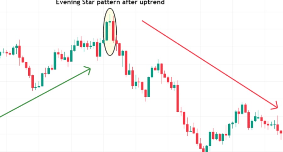
2. Evening Star
-
What It Is:
- The Evening Star is a bearish reversal pattern consisting of three candles: a long green candle, a small-bodied candle (red or green), and a long red candle.
-
Significance:
- This pattern indicates that the upward momentum is losing steam, and sellers are taking over.
-
Key Characteristics:
- The middle candle shows indecision or reduced momentum.
- The third candle closes below the midpoint of the first.
- Typically forms at the end of an uptrend.
| Pattern | Trend Location | Signal | Key Feature |
|---|---|---|---|
| Bullish Engulfing | Downtrend | Bullish Reversal | Green candle engulfs prior red |
| Morning Star | Downtrend | Bullish Reversal | Three candles; middle candle is small |
| Bearish Engulfing | Uptrend | Bearish Reversal | Red candle engulfs prior green |
| Evening Star | Uptrend | Bearish Reversal | Three candles; middle candle is small |
Continuation Patterns: Rising and Falling Three Methods
These patterns are essential indicators of ongoing trends, often signaling a brief consolidation phase before the trend resumes. They appear in bullish (rising) and bearish (falling) market conditions:
1. Rising Three Methods (Bullish Continuation):
-
Occurs in an uptrend.
-
Starts with a strong bullish candle.
-
Followed by three or more smaller bearish candles that stay within the range of the first bullish candle.
-
Ends with another strong bullish candle that closes above the high of the initial bullish candle, confirming the continuation of the upward trend.
These patterns reflect temporary market pauses before the prevailing trend continues.
Significance of Doji Patterns
Types of Candlestick Patterns and Their Interpretation
-
1. Single Candlestick Patterns
- Doji: Represents indecision with opening and closing prices nearly the same, hinting at a potential reversal or consolidation.
- Hammer and Hanging Man: Small bodies with long lower shadows, indicating possible reversals; the context of the trend determines bullish (Hammer) or bearish (Hanging Man) sentiment.
- Inverted Hammer and Shooting Star: Similar patterns indicating trend reversals, with long upper shadows reflecting pressure in opposing directions.
-
2. Multi-Candlestick Patterns
- Bullish Patterns:
- Engulfing: A large green candle fully engulfs the prior red one, signaling a reversal to the upside.
- Morning Star: A three-candle reversal pattern with a small body candle between a long red and a long green candle.
- Bearish Patterns:
- Engulfing: A large red candle engulfs the prior green one, signaling downward pressure.
- Evening Star: A bearish reversal counterpart of the Morning Star.
- Bullish Patterns:
-
3. Continuation Patterns
- Rising and Falling Three Methods: Indicate ongoing trends, with small candles consolidating within the larger trend’s range.
-
4. Market Indecision Patterns
- Spinning Top: Small body with long shadows indicates a balance of buying and selling.
- Doji Star: Highlights indecision, often preceding reversals when confirmed by trend changes.
-
5. Using Candlestick Patterns Effectively
- Confirmation Signals: Validate patterns with volume spikes or other indicators like RSI, MACD, or moving averages for better reliability.
- Psychological Insights: Patterns reflect trader sentiment, from bullish optimism (e.g., Hammers) to bearish caution (e.g., Hanging Man).
- Time Frame Importance: Longer time frames provide stronger signals than shorter periods, impacting the weight of analysis.
-
6. Practical Applications in Trading
- Entry/Exit Strategies: Use patterns for identifying precise entry and exit points.
- Risk Management: Set stop-loss and take-profit levels aligned with pattern dynamics to mitigate risks and secure gains.
Putting It All Together
Candlestick patterns is an essential skill for any trader, as these visual tools provide valuable insights into market sentiment and potential price movements. By understanding the nuances of each pattern—whether single, dual, or multi-candlestick formations—you can make more informed decisions and enhance your trading strategies. Remember, while candlesticks offer powerful clues, they work best when combined with other technical indicators and sound risk management practices. The key is not just to spot patterns but to interpret them in the broader context of the market. Happy trading!
Written by Suchitra
4th Mar 2025 / 17 Mins Read
Featured Posts

By Asma Torgal
8th July 2024
Stock Market Sentiment Drives Trading Decisions

By Tejaswi P
30th Aug 2024
Can Government Employees Do Trading in the Stock Market?
_11zon.webp?alt=media&token=bd974821-aee4-43a5-b467-01d1a67a570b)
By Suchitra
29th Mar 2025
Algo Trading in India Tech-Driven Strategies for Modern Investors
_20_11zon.webp?alt=media&token=6659b2e6-927e-42de-8375-e227e579f556)
By Asma Torgal
28th Mar 2025
Trading Across Time Zones, The Global Market Timings in IST
By
Fri Mar 21 2025
How to Use Parallel Channels, Trends & Patterns
_11zon.webp?alt=media&token=a8f3f55c-dc70-4d42-844e-6874ceff69ce)
By Suchitra
20th Mar 2025
Swing and Positional Trading with Pivot Points
_11zon.webp?alt=media&token=a05d2324-cace-44ed-a35f-50f9e63be9c3)
By Suchitra
13th Mar 2025
How Central Banks Influence Indian Stock Market Trends
_11zon.webp?alt=media&token=14cd8f87-8add-49ce-84f1-ca07a0c52b0c)
By Suchitra
12th Mar 2025
Two Essential Candlestick Patterns for Market Timing

By Suchitra
05th Mar 2025
How Algorithmic trading revolutionizes modern markets with efficiency and speed
By Asma Torgal
24th Sep 2024
Lot Size in Futures & Options Trading